C
Citizen Digital
Guest
doctype html>

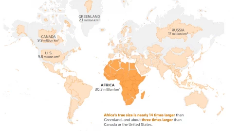
This graphic fixes the distortion created by the Mercator map, which exaggerates the size of countries far from the equator. By scaling each country according to its latitude, the map reveals their true proportions.
The Mercator map, first created in the 16th century, has long been the standard map used for navigation and education, but it stretches land masses farther from the equator.
For example, Greenland often appears as big as Africa on a Mercator map, when in reality Africa is about 14 times larger.
Many other northern nations look comparable in size to the continent of Africa when they are in fact smaller by land area.
Africa is about three times larger than Canada and more than one and a half the size of Russia, yet the Mercator projection has long made students think those countries are comparable in size — or even larger — than Africa.
The African Union, a political and economic organisation of 55 African countries, has endorsed the “Correct The Map” campaign, advocating for replacing the Mercator projection with the Equal Earth projection, a map that accurately represents the relative sizes of countries.
“The current size of the map of Africa is wrong,” Moky Makura, executive director of Africa No Filter, said. “It’s the world’s longest misinformation and disinformation campaign, and it just simply has to stop.”
“It might seem to be just a map, but in reality, it is not,” AU Commission deputy chairperson Selma Malika Haddadi said, adding the Mercator fostered a false impression that Africa was “marginal”, despite being the world’s second-largest continent by area, with over a billion people.
Maps are never a perfect reflection of reality. Any attempt to flatten a spherical Earth onto a piece of paper or a screen introduces some distortion. It’s like peeling an orange and trying to press the pieces flat on a table: shapes stretch, tear or shrink depending on how they are laid out.
Cartographers needed a way to represent the geography of the globe on flat maps with mathematical precision that would make them reliable tools for navigation. The dominant approach was to project the globe onto a geometric shape that could be unfolded flat — a technique called “projection.”
The Flemish cartographer Gerardus Mercator chose a cylinder. His idea worked especially well for navigation in the era of sailing ships because it represented ‘rhumb lines’ — paths of constant compass bearing — as straight lines, criss-crossing a perfectly rectangular map.
Mercator’s projection became the standard for studying geography for centuries, leading students to see places like Greenland, Canada or Russia as much larger than they actually are.
Criticism of the Mercator map is not new, but the “Correct The Map” campaign, led by advocacy groups Africa No Filter and Speak Up Africa, has reignited the conversation, urging organisations to adopt the 2018 Equal Earth projection, which aims to reflect countries’ true sizes.
When scaled proportionately to true land area, Africa can fit the United States, China, India and most of Europe within the continent — comparisons that conventional maps like Mercator’s obscure.
Every map projection serves a purpose, but each involves trade-offs. Cartographers have developed dozens of different projections over centuries, each prioritising certain geographic features while sacrificing others. Some preserve accurate shapes but distort sizes, while others maintain correct areas but warp distances or directions.
Those choices may seem abstract but can easily bleed into the world of politics and perception of importance.
The AU and other regional groups want organisations like the World Bank and the United Nations to adopt the Equal Earth map. A World Bank spokesperson said they already use the Winkel-Tripel projection or Equal Earth for static maps and are phasing out Mercator on web maps.
Google Maps switched from Mercator on desktop to a 3D globe view in 2018, though users can still switch back to the Mercator if they prefer. On the mobile app, however, the Mercator projection remains the default.
Dorbrene O’Marde, vice chair of the Caribbean Community (CARICOM) Reparations Commission, endorsed Equal Earth as a rejection of the Mercator map’s “ideology of power and dominance”.
©Citizen Digital, Kenya
Continue reading...
- Africa is about three times larger than Canada and more than one and a half the size of Russia, yet the Mercator projection has long made students think those countries are comparable in size — or even larger — than Africa.

This graphic fixes the distortion created by the Mercator map, which exaggerates the size of countries far from the equator. By scaling each country according to its latitude, the map reveals their true proportions.
The Mercator map, first created in the 16th century, has long been the standard map used for navigation and education, but it stretches land masses farther from the equator.
For example, Greenland often appears as big as Africa on a Mercator map, when in reality Africa is about 14 times larger.
Many other northern nations look comparable in size to the continent of Africa when they are in fact smaller by land area.
Africa is about three times larger than Canada and more than one and a half the size of Russia, yet the Mercator projection has long made students think those countries are comparable in size — or even larger — than Africa.
The African Union, a political and economic organisation of 55 African countries, has endorsed the “Correct The Map” campaign, advocating for replacing the Mercator projection with the Equal Earth projection, a map that accurately represents the relative sizes of countries.
“The current size of the map of Africa is wrong,” Moky Makura, executive director of Africa No Filter, said. “It’s the world’s longest misinformation and disinformation campaign, and it just simply has to stop.”
“It might seem to be just a map, but in reality, it is not,” AU Commission deputy chairperson Selma Malika Haddadi said, adding the Mercator fostered a false impression that Africa was “marginal”, despite being the world’s second-largest continent by area, with over a billion people.
Maps are never a perfect reflection of reality. Any attempt to flatten a spherical Earth onto a piece of paper or a screen introduces some distortion. It’s like peeling an orange and trying to press the pieces flat on a table: shapes stretch, tear or shrink depending on how they are laid out.
Cartographers needed a way to represent the geography of the globe on flat maps with mathematical precision that would make them reliable tools for navigation. The dominant approach was to project the globe onto a geometric shape that could be unfolded flat — a technique called “projection.”
The Flemish cartographer Gerardus Mercator chose a cylinder. His idea worked especially well for navigation in the era of sailing ships because it represented ‘rhumb lines’ — paths of constant compass bearing — as straight lines, criss-crossing a perfectly rectangular map.
Mercator’s projection became the standard for studying geography for centuries, leading students to see places like Greenland, Canada or Russia as much larger than they actually are.
Criticism of the Mercator map is not new, but the “Correct The Map” campaign, led by advocacy groups Africa No Filter and Speak Up Africa, has reignited the conversation, urging organisations to adopt the 2018 Equal Earth projection, which aims to reflect countries’ true sizes.
When scaled proportionately to true land area, Africa can fit the United States, China, India and most of Europe within the continent — comparisons that conventional maps like Mercator’s obscure.
Every map projection serves a purpose, but each involves trade-offs. Cartographers have developed dozens of different projections over centuries, each prioritising certain geographic features while sacrificing others. Some preserve accurate shapes but distort sizes, while others maintain correct areas but warp distances or directions.
Those choices may seem abstract but can easily bleed into the world of politics and perception of importance.
The AU and other regional groups want organisations like the World Bank and the United Nations to adopt the Equal Earth map. A World Bank spokesperson said they already use the Winkel-Tripel projection or Equal Earth for static maps and are phasing out Mercator on web maps.
Google Maps switched from Mercator on desktop to a 3D globe view in 2018, though users can still switch back to the Mercator if they prefer. On the mobile app, however, the Mercator projection remains the default.
Dorbrene O’Marde, vice chair of the Caribbean Community (CARICOM) Reparations Commission, endorsed Equal Earth as a rejection of the Mercator map’s “ideology of power and dominance”.
©Citizen Digital, Kenya
Continue reading...

